I didn´t spot completely game-changing innovation, however, for the trained design and trend-savvy eye, there were beautiful move-ons from previous themes and lovely touches of newness throughout the exhibitions. Most of the designs and colours shown I forecast two years ago.
At the press office at #MO21. Thanks for the excellent support dear M&O team!
Three major influences drive this slow-down:
– Brands have less money to spend due to the global impacts of the corona crisis or have shifted their budget more towards macro-trends rather than investing in design trend consultancy. However, really good design needs really good research – insight and inspiration are equally as important. The results are now vastly indistinguishable product lines.
– Brands are more risk-averse. Falling back to classics and cash cows is a common strategy in times of uncertainty. However, customers still expect a certain level of fresh input to be enticed to buy.
– Brands consciously stop pushing for newness for the sake of it as a response to heightened pressure for sustainable business practices. More informed than ever, customers reject greenwashing and expect real commitment and brands taking responsibility. We now see some brands showcasing the new collections alongside products of former seasons. This approach is more similar to the layering in most people´s homes. Reworking well-selling products to be ecological and creating fair working conditions for the people producing the goods and working within the delivery chains is a viable option. Moving forwards intersectional environmentalism is key for future-proofing businesses.
Hübsch Interiors smartly combining products of current and previous collections.
Overall, the fair and surrounding exhibitions were smaller and visited by a lot fewer international guests. The Maison & Objet fair team did well to drastically cut down on plastic waste and to make recycling easier than ever.
Reach out if you want constructive, straightforward feedback or my input on your design or trend projects.
It feels so long and not long ago that I worked on the Trend Bible SS21 Home & Interiors trend book in-house based in Newcastle. The trends we published in 2019 are a huge success. You can now find them anywhere: H&M HOME, Habitat, West Elm, ferm LIVING, Anthropologie, Target, Westwing, MADE.COM, Maisons du Monde, La Redoute, Dunelm, Matalan, AMARA Living Ltd., Broste Copenhagen,…
Some of you already know that I have continued collaborating with the TB team remotely. Today I have done my last review on SS23 which I creatively co-directed with Naomi Pollard. On the 5th of July, the ebook will be published. Well proud of what we have achieved. Great work, team! Special thanks to trend researcher Jamie Hannah Shackleton for going above and beyond to make this look and read as ace as it does. Think it’s the most well-rounded book I’ve worked on so far. Sooo much inspiration for designers, retailers, manufacturers and brands working around #lifeathome. Mid-July we’ll already start on the in-depth work for AW23/24 which I’ll creatively direct again.
These images are a glimpse into the making of a trend story called Urban Retreat. It was already set to have a big impact on interiors for 2021, but the pandemic has accelerated the need for green spaces within urban environments. Expect to see more architectural details influence design direction as a whole for the seasons to come.
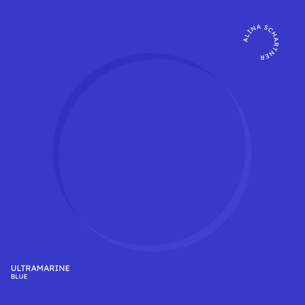
Colour of the day: Ultramarine Blue Simple description: a deep vivid blue
Notes for usage: Ultramarine blue is high energy. Its vibrant, mesmerising glow is so powerful, that it even adds zing to shady spaces. This colour is always a statement. Consider softening it with chalky white for small spaces, to avoid an overwhelming effect. Even little amounts of this colour will draw attention.
For a straight, graphic look try pairing it with crisp white and black. Small accents of Ultramarine next to gentle pinks make the colour seem more approachable. The brave add a colour pop with crimson red or neon orange; however, I would recommend sticking to homoeopathic doses, unless you know exactly what you’re doing.
Made globally recognised by artist Yves Klein, who described the colour as the expression of ultimate freedom, it has never lost its edgy appearance since the 1960s. Historically, ultramarine blues were won from ground Lapislazuli, meaning they were extremely expensive for centuries. Synthetic ultramarines are cheap, which make them popular choices for mixing wall paint or neutralising unwanted yellow tinges from paper to bleached hair.
For surface design, I prefer ultra-matte, dry-looking finishes for these shades of blue, to not take anything away from the depth and intensity of the colour. Glossy ceramics can work well though, particularly when handmade effects are still visible. High-shine surfaces can seem artificial and but also visionary. Admittedly, Ultramarine Blue is not the easiest colour to work with on a large scale, but sometimes that is exactly where the serious excitement starts.
PS: I had shared information about ultramarine blue before, but this colour group continues to grow in imporatance from product to lighting design.
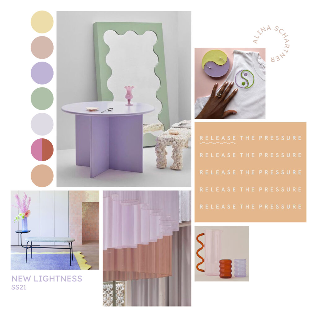
Feeling ready for Spring Summer 2021? Baked and faded tones are reminiscent of the warmth of sun-soaked days spent in laid-back retreats in Southern Provence.
‘La Belle Vie’ is one of the trend stories I developed with my team at Trend Bible in early 2019. It´s lovely seeing what we predicted to gain importance on the high street now. The palette I designed for this modern rustic look is still one of my favourites with its nonchalantly relaxed charm.
When I selected the nuances I made sure they work in various lighting conditions – not just in regions naturally gifted with more sunshine. The palette certainly still cheers me up and I love how versatile it is. You can easily combine any of the shades with each other.
As an advocate for more sustainability within trend forecasting, I believe we should not suggest new or more colours for the sake of it. Whenever I develop a collection, I also look at other ranges for the same season. For brands that focus on longevity, I make sure they harmonise with older ones.
Pale Olive RAL 095 80 20 will be important throughout 2021 and beyond. Gentle greens make us feel more connected to nature all year round.
Wheat Flour White RAL 080 85 05 is the perfect match; it is a move on from all the greys we have seen previously. Over the last few seasons, there was a general shift towards warmer and more earthy nuances on a global scale. However, at home and often also in retail products of many seasons are combined. This is a fantastic colour to layer on top of cool greys as well.
Fox Red RAL 040 50 60 is an eye-catching warm shade. In ‘MODERN COTTAGE’ (previous post) it is used in tiny quantities. Alternatively, you could also try Foxflower Viola RAL 280 70 15. In ‘HOUSE BAR’ (next post) it sets a bolder statement. This colour works better with off-whites; bright white can make it look garish. But do have a try at some of the combinations I´ve shown in the mood boards!
NEW LIGHTNESS encourages us to freshen up our homes after the longest winter ever. Let’s boost our physical and emotional wellbeing with colour and light. Ready for a new wave of upbeat designs?
Clubs have been shut for so long it’s time to turn up the volume at home! Bored of the grey dominating the last decade, we now see increased enthusiasm and bravery to revamp bland interiors. As we move through 2021, more homemakers seek to surround themselves with fun decor.
Scalloped, arched and squiggly shapes continue to grow in popularity. Motifs inspired by 90s rave culture move from fashion to interior design. Translucent materials, colour gradients and mirrors make rooms seem more spacious. Clever ideas for zoning and lightweight, flexible products are vital as the home has taken on more functions.
Combining pastels with chromatic neutrals and bolder accents prevents the overall appearance from looking too sweetly. Rough textures and a mix of matte and glossy finishes add interest. Print, pattern and messaging reflect the uplifting spirit.
I already forecast a rising awareness to use colour and light for therapeutic measures in early 2019. This trend was accelerated for larger parts of the population by all of us spending more time at home than ever in 2020. Expect to see a shift towards more extraordinary and playful design in the years to come.
I completely reworked some 2021 mood boards to show you how I inform different markets. This is a trend for the world´s youthful early adopters. It will continue to gain more traction amongst mavens and early adopters; from London to NY, Tokyo, Copenhagen, Stockholm, Milan and back to Berlin.
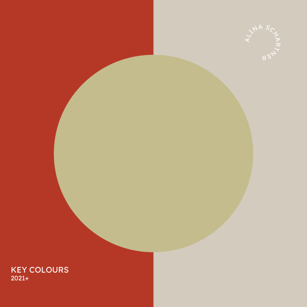
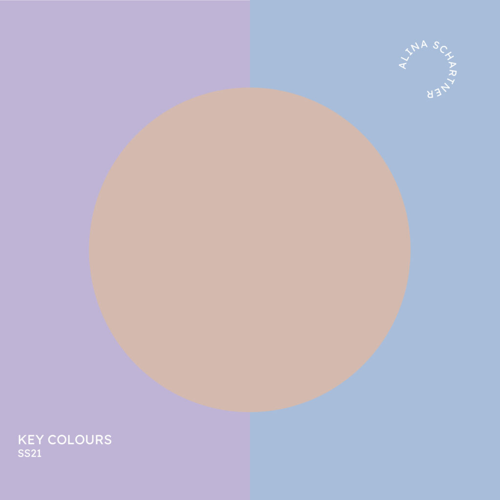
The selected key colours are based on my research for 2021 (from early 2019-present). I consider how they work across interior design and lifestyle trends. Each of the colours is part of a collection of 7-8 shades. Have you noticed that the circular key colour features in the mood boards before and after this post?
Pale Siena RAL 050 60 10 pairs well with many shades. For Spring Summer 2021 warm, soft clay tones receive a freshen-up with cooler nuances.
In ‘MEDITERRANEO’ they sit at ease with other baked nuances in this mostly analogous colour scheme. The palette is inspired by natural materials used in traditional Southern European architecture. Wind Blue RAL 260 80 15 feels like a mild breeze coming in from the sea. It adds a contemporary twist to the overall look.
In ‘NEW LIGHTNESS’ Pale Siena takes on a completely different function. Here it is used to soften the impact of brave shades such as Ice Mauve RAL 300 80 15 or Techno Pink RAL 350 70 30. Did you spot, that Terra Orange RAL 040 60 40 and Biscuit Beige RAL 060 80 20 also appear in both colour palettes?
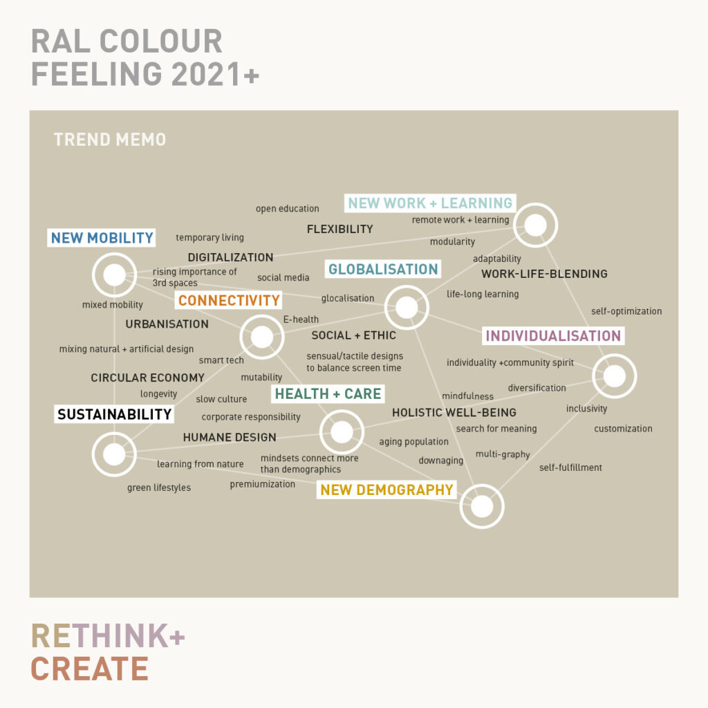
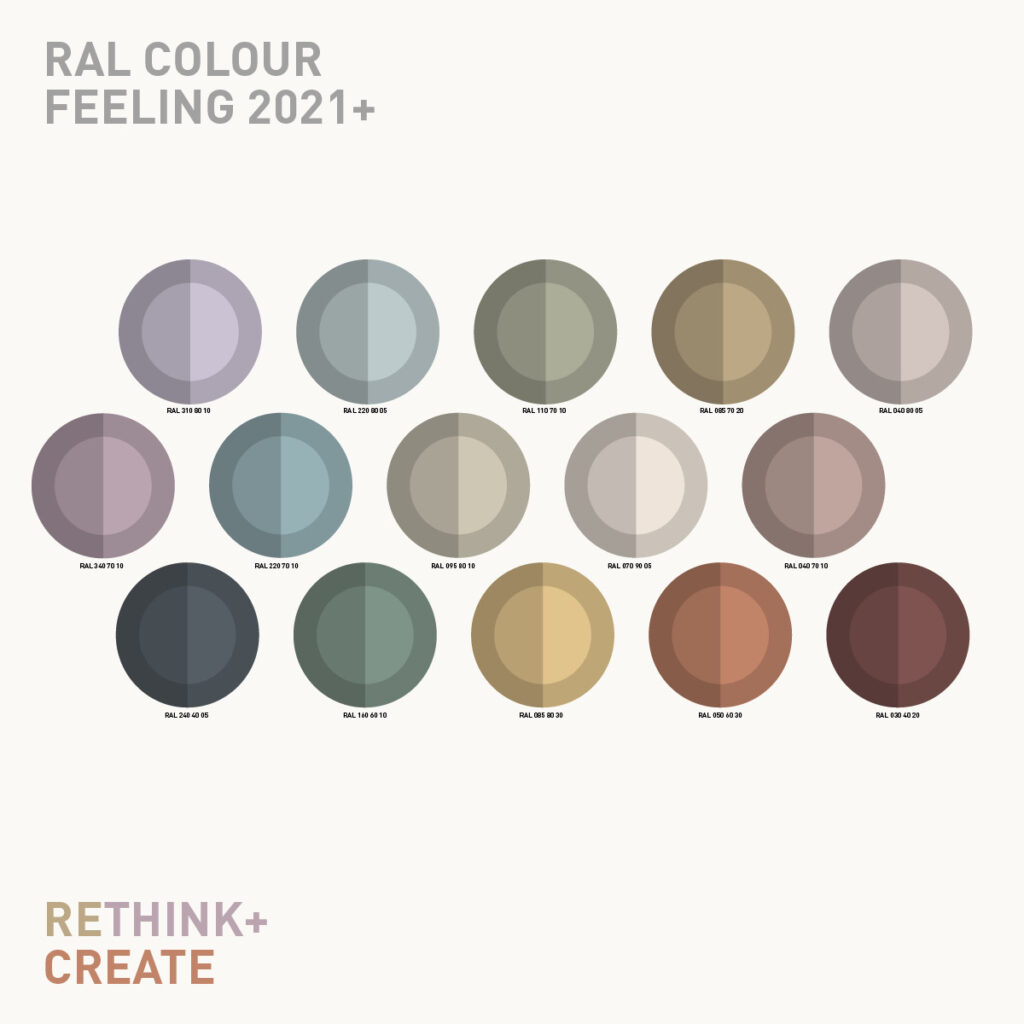
reThink stands for a humane use of colour which is easy to implement.
With reThink we are providing designers and architects with a 15-part colour space as a tool for future-oriented designs. The shades selected are very well-suited to product design/architecture and flexible so they can be adapted to a range of requirements.
The complete PDF of the current issue can be downloaded HERE.
Borders are increasingly blurring between our private and professional lives, action and regeneration, global and local issues. We therefore want to provide suggestions for designing these new interpersonal living spaces through corresponding colour combinations. We call the confrontation with the current topics of our times – in particular how we want to live and work in the future – and their colours reThink. The result is a colour world with the challenge to all designers to integrate it into their projects: CREATE!
The colours selected for this are based on the observation and analysis of social, technical and design trends over the last 50 years until today. However, the colour spectrum developed also refers to basic design categories and detailed studies regarding colour effect and colour perception. In addition to the visual function, the focus is also on the combination with sensual perceptions and cultural meanings of colours.
Our goal was not to define fixed trend colours, but to develop a current to sustainable colour profile, which creates design possibilities instead of reducing them.
The colour language of reThink has an inspiring and at the same time grounding effect. In a world view that increasingly appreciates sustainability, an easy combinability and longevity become key requirements for design.
reThink encourages the creation of spaces and products that create long-term added value. The colour range invites you to feel, think, rethink and combine freely. Polarities – such as natural/artificial or monumental/filigran – complement each other in this unobtrusively inspiring colour space. Together with the RAL Design System plus this colour space is integrated into a complex colour system and can easily be expanded.
reThink is the impulse for a society where empathy and humane objectives are important. Wisdom from earlier cosmopolitan eras, such as the Renaissance, is combined with visions for a better future. In a networked and unpredictable world, we see an increased orientation towards values of mindfulness and holistic prudence.
The Slow Culture movement, which has grown out of the megatrends of neo-ecology, health and a new culture of knowledge, is focusing on greater appreciation of resources in the long term. Creativity and a creative drive are combined with a growing holistic sense of responsibility on a global and individual level.
Appealing colours and sensual surfaces create a positive relation to our surroundings.
Subtle, variable colours and sensual surfaces create a balance to the digitalization and sensory overload of everyday life. The range is characterized by a reserved, changeable colourfulness. Matt shades reminiscent of lime paint and chromatic shadowy tones create versatile applicable harmonies. Selected shade-in-shade combinations modulate empty spaces discreetly.
Thanks to mainly light to medium tonalities, the overall impression is light and yet solid. Materials inspired by clay, stone, loam and sturdy plasters provide strength and sensitive textures. By using light, transparencies and soft graduations an airy atmosphere is created. Despite being unobtrusive, surface and product designs appear imaginative, personal and approachable.
I was one of the CMF specialists, trend forecasters and also one of the two main editors on this project. Really loved this collaboration with RAL colours and IIT Institute International Trendscouting. All work was done fully remote. To guarantee colour accuracy, we all used RAL Design System plus original samples. Well done team!
We work globally and care about colour education: The trend report is available in English, German, Chinese, Spanish, French, Russian or Dutch for free. Share this info with anyone who should know about it. You can even download the colour palette as .ase files to easily integrate them into your digital workflow.
‘Form follows seduction’ as artist and designer Adam Nathaniel Furman so rightly updated the often misinterpreted ‘form follows function’, which led to a tremendous lack of understanding colour on a global scale. If you compare the curriculums of the vast majority of universities for architecture and design, you’ll notice, that colour is a side note if it is mentioned at all.
Did you know that colour is usually the first and most influential impression we have about any object? Roughly 85% of all purchasing decisions can be directly attributed to colour.
Why is it, that so many designers and architects shy away from colour apart from the monochromatic and standard material driven palettes they have become used to? If you ask me the truth isn’t just found in their appreciation for functionality. I don’t think every design needs to be purely functional. In my opinion, the reason is often, that you have to be a more knowledgeable creative to do maximalist designs well compared to minimalist ones.
Readily available information on colour theory and use is often too trivial and dogmatic for today’s complex world. Do a random search engine search and you’ll find out, a lot of the data is too simplified.
Therefore sticking only to black, grey, white and other so-called neutrals? We can often do better than that. Check out the marvellous feeds of extraordinary talents like Adam. Follow people who know how to work with colour professionally. Recommend those inspiring feeds to anyone you know, who could benefit from it.
After years of predominantly pared-back designs, colourful extravaganza is rising exponentially. Maximalism is boldly influencing the direction design will be heading in the years to come. Get prepared. The biggest trends in colour design currently are MORE colour and BRAVER combinations.
Colour of the day: Medium Taupe Simple description: a medium grey-brown
Notes for usage: Meet the world´s most underrated colour group. The name simply means ‘mole’ in French (please pronounce it French!). Blending brown and grey, taupes are incredibly versatile. As plain greys have long reached the mass market, expect earthier ‘neutrals’ to gain momentum in the years to come. Currently, there’s also a trend for mixing cooler with warmer shades, where taupes can often provide a clever link.
As with most shades of brown and grey, there’s hardly anyone who would call taupe their favourite colour and yet, it’s highly popular and invaluable for interior design. As a tertiary colour it can be derived from a number of base colours, so the perfect taupe will depend on the other colours involved. However, it’s usually a colour group that pairs well with most partners. Taupe can offer what many hope to achieve with black yet it’s sooo much more harmonious with more colours.
Its unobtrusive, dirt-resistant but sensuous quality makes taupe a product designer´s darling. I prefer matte, silky, velvety and suede leather inspired textures for a premium, natural look. For textile design, it works beautifully with mauve yarns in duo-tone taffetas. Imagine applying the effect on coloured glass or metallic surfaces. Go and play with it!