Categories
Colour

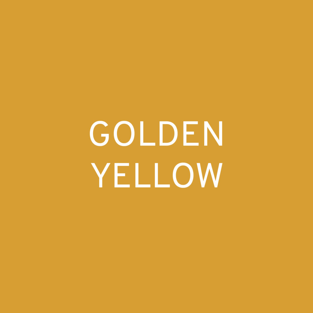
Colour in Context: Golden Yellow

Colour of the day: Golden Yellow

Simple description: a deep warm yellow

Notes for usage: Radiating mellow warmth and natural abundance, Golden Yellow draws attention without being overwhelming. Yellows generally tend to be very susceptible to changing light. However, Golden Yellows derived from ochre bases mixed with bold yellow pigments and umbers keep their sunny glow even in shady conditions. It’s high grey content make this nuance suitable for large scale use in rooms facing any direction.

For surface design feel free to experiment. I prefer dry, matte finishes and signs of craftsmanship or imperfection on high gloss ceramics with this shade. It’s also an amazing colour for felting, wool-knits and rugs, echoing the materials warming properties. Options are vast though, as you haven’t got to worry about shadows. You´d be surprised with how many colours this bold shade works when it hugs their companions with that irresistible generosity.

PS: Yes, this is one of my all-time favs, although I only own golden yellow tights. I do have four pairs though and they cheer me up during those nasty European winters (double or triple layering 🙄).

Categories
Colour Material

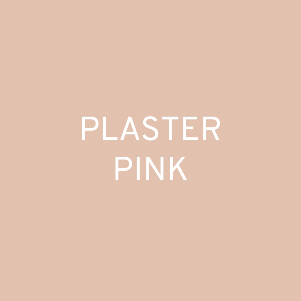
Colour in Context: Plaster Pink

Colour of the day: Plaster Pink
Simple description: a subtle earthy pink

Notes for usage: This is THE colour to use if you want all the positive connotations of pink, without its stereotypical clichés. It is soft, but not sweet and more grown-up than many other nuances in the pink colour family. Plaster Pink is, well, the colour of setting plaster. Bridging the gap between beige and pink it is reminiscent of sandstone. Its constructive qualities make it an excellent architectural colour.

Did you know it was also popular during the Modernist Movement? Don´t let yourself be fooled by black-and-white imagery of the time. Le Corbusier and various artists at the Bauhaus appreciated its natural, warm and unobtrusive appearance. Back in the day mixing red earth pigments with white chalk for outdoor rendering and indoor plaster was very common. With a renewed focus on natural dyes and paints, these colourants have made a strong comeback in contemporary colour design.

With grey wall paint having long reached the mass market, we see a rising interest in chromatic neutrals. Plaster Pink is getting increasingly popular for large scale use in interior design. This chalky just-about-pink is comforting and warming at any time of the day. When it is kissed by the golden glow of a setting sun then magic happens.

Plaster pink is easy to use for surface designers, as it works well in any lighting condition. However, it lends itself particularly well for dry, matt finishes. When newness and longevity need to be paired, this is a suitable colour choice to update tech products and homeware ranges.

Categories
Colour Trend

Colour in Context: Terracotta Pink

Colour of the day: Terracotta Pink
Simple description: an earthy pink

Notes for usage: As the fascination with Millenial Pink is slowly fading, we see an evolution towards warmer, earthier shades. These nuances occupy a special position among the pink colour family. They have a completely different effect than their sugary or brightly coloured relatives, which most people immediately think of when they hear pink.

Terracotta Pink exudes a sense of natural luxury and longevity. It appears sensual, relaxed and humane. The overall impression is more grown-up than youthful. Classic gender assignments are blurred, although many products offered in this colour mainly address a feminine target group. Terracotta Pink relatively easy to combine. With crisp white, grey and black it appears more graphic and classy. Pair it with ecru, blush and taupe for a nonchalantly pleasant feel. Add pastel blue and cinnamon brown and the result is a homely mix with a little retro appeal. But earthy pink tones are also open to strong contrasting partners such as ultramarine blue or mustard yellow.

Terracotta Pink is a surface design all-star. Use powdery matt, velvety shimmering or high gloss finishes to show the multifaceted applicability of this colour. And did you know it also works well in most lighting conditions?