Categories
Colour Industry Expertise Trend

Visions for Love 2021+

Let´s make celebrating love fully inclusive; not just on Valentine´s Day but all year round.

Did you know that the name is derived from Latin ‘valentia’ meaning strength or capacity?

14 February is often disliked by singles, people in unfulfilling relationships and happy couples not conforming to stereotypical norms alike.

In recent years we have seen the rise of #galentines celebrations – female friends gifting one another to express their non-romantic love. It´s a step moving forwards.

But there is still untapped potential for the gift and greetings industry to offer options outside of heteronormative clichés. We also have to do more than rainbow prints if we mean equality for the LGBTQ+ community.

#loveislove

‘MON AMOUR’ inspires us to think outside the box of gender assigned designs. This mood board gives romantic love between men a voice. However, the imagery is chosen to be welcoming to all; men, women, non-binary people with all their sexual preferences. Conceptions of female and male colours are challenged. Mauve tones, deep blues and reds ooze sophistication, whilst a pop of bold red amplifies the contemporary edge of this dreamy story.

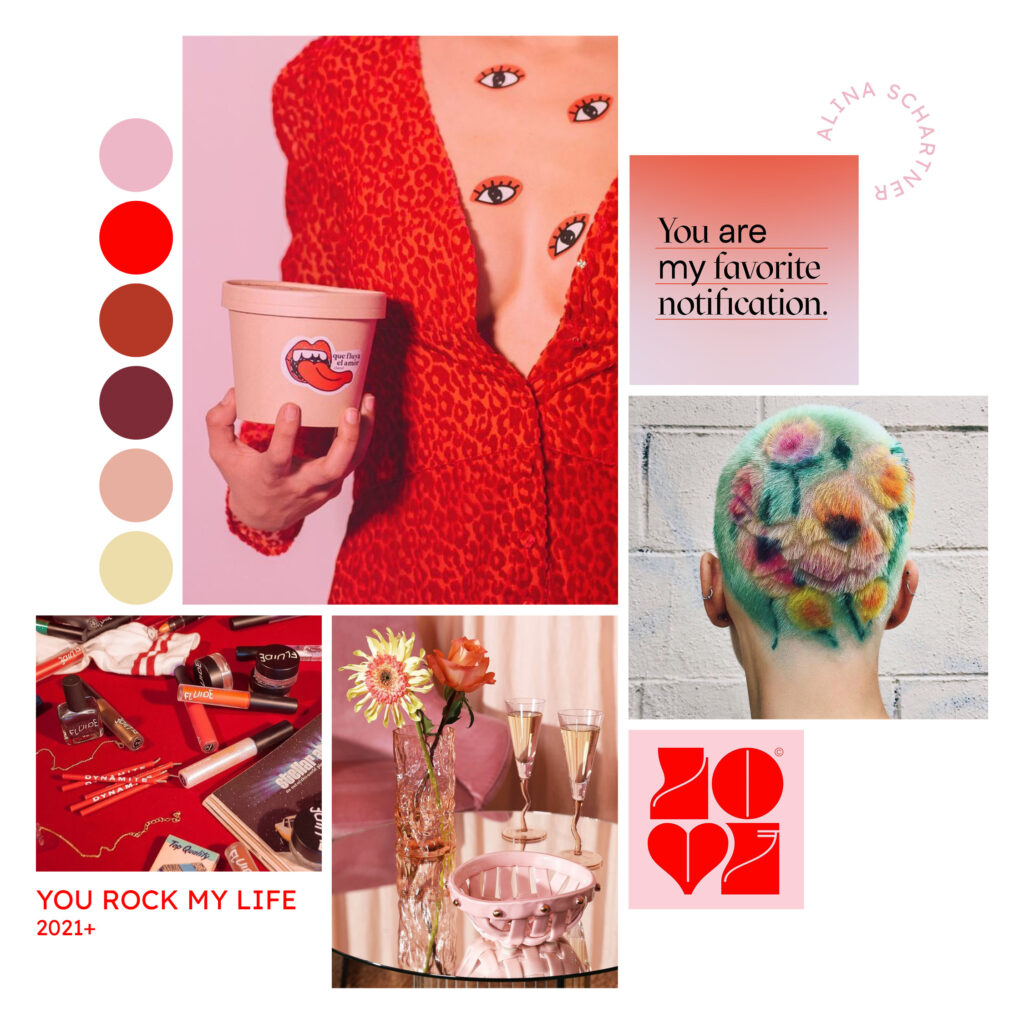
‘YOU ROCK MY LIFE’ shouts out loud for love in various forms – from passionate and sexy to amicably asexual. The mood board opens us to the idea of gifting loved ones regardless if we are in a romantic relationship or not. Messaging is fun and cheeky. Gentle pinks – playing with warm and cool undertones – serve as background colours for clashing reds. Soft yellow adds an element of surprise in this vastly monochromatic colour scheme.

Have you noticed, that some of the nuances also feature in other trend stories I have created for 2021+? Using overarching colours ensures different collections work with each other. This approach is more sustainable, as it´s easy to integrate stock that did not sell the following season/year. If your brand values seasonless design then you will notice the benefits of smart colour combinations even more.

Send an e-mail to hello@alinaschartner.com to talk about how I can inspire your brand on design and colour direction or finding the right narrative tone.

Image sources clockwise from top left: MON AMOUR Hotel Deux Gares designed by Luke Edward Hall 〰️ Jil Koehn 〰️ Hotel Il Palazzo Experimental 〰️ Lex Pott 〰️ Théo Tourne 〰️ Lottie Hall Stuio YOU ROCK MY LIFE Guía oca 〰️ Consches 〰️ Janine (Cortez) Ker 〰️ Kissmiklos 〰️ &k amsterdam 〰️ Fluide Beauty

Categories
Colour Trend

Colours of the Month: Rainbow Colours

Colours of the month: Rainbow Colours
Simple description: a spectrum of colours


Notes for usage: Traditionally rainbow colours were quite literally inspired by the natural phenomenon of the same name. These light reflections encompass a spectrum between purple, indigo blue, cyan, green, yellow, orange and red nuances. In mythology, rainbows represented hope and peace, for several cultures for millennia. As of the late 1970s, rainbow flags became symbols for LGBTQ+ social movements.

Colours and Meaning

The original multicoloured, striped flag by Gilbert Baker for the Gay Freedom Day Parade of 1978 in San Francisco featured eight colours. The flag´s designer and activist attributed a specific meaning to each of the colours: Hot pink-sex, red-life, orange-healing, yellow-sunlight, green-nature, turquoise-magic/art, indigo-serenity, purple-spirit. Note, pink was already a symbol of what would develop into the LGBTQ+ community previously, despite negative connotations, as a pink triangle was used in concentration camps during the Nazi regime to mark homosexuals.

Versions of the Rainbow Flag Symbol within the LGBTQ+ Community

Various versions of rainbow flags are now globally understood as symbols of LGBTQ+ identity, solidarity and pride. Three main tendencies can be monitored:

  1. The most common version of the rainbow flag nowadays uses only six colours. Red, orange, yellow, green, (indigo) blue and purple were initially chosen for pragmatic reasons – most notably the availability of coloured fabrics for mass production of the flags.
  2. In an attempt to visualise diversity, versions of the rainbow flag have incorporated more and/or different colours (for instance hints at various human skin colours) and combinations with other symbols. Critics warn this can be distracting from the core message of equality of all and the unity of humankind.
  3. As of the late 2010s, more abstract and free variations of the rainbow flag symbol are growing in popularity. This development can be interpreted as a sign for rising awareness, that true inclusivity is open-minded and welcoming for all.

Have you noticed more references of June being Pride Month this year? The celebration of LGBTQ+ Pride Month is not internationally recognised to take place in June, as pride celebrations take place in many different places at different times.

The acronym LGBTQ+ is increasingly interchanged with LGBTQQIA+ meaning lesbian, gay, bisexual, transgender, queer, questioning, intersex, and asexual people are included. The plus symbol stands for potentially expanding and fully inclusive. What is your opinion on the matter? How important is it in each case to visualise diversity with specific colours or letters? When do you think we will all be ready for full-spectrum humanism?